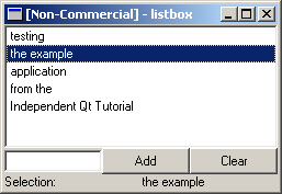
Most applications tend to show data in the form of lists, tables and trees. This need is met by Qt throught a number of classes ranging from simple text-lists to complex tables. We start in the simpler end by dealing with QListBox shown in figure 13-1.
Figure 13-1 The QListBox example application
QListBox is the simplest form of a list. It is normaly used to show a single column of text items but can be used in more advanced contexts. When showing a list of text items the methods insertItem or insertStringList are used to build the list. To clear the list, use the method clear to remove all items from the list. This is demonstrated in the code in example 13-1.
ListBoxExample::ListBoxExample( QWidget *parent, char *name ) : QVBox( parent, name )
{
m_listBox = new QListBox( this );
QHBox *hb = new QHBox( this );
m_lineEdit = new QLineEdit( hb );
QPushButton *pbAdd = new QPushButton( "Add", hb );
QPushButton *pbClear = new QPushButton( "Clear", hb );
connect( pbAdd, SIGNAL(clicked()), this, SLOT(addItem()) );
connect( pbClear, SIGNAL(clicked()), m_listBox, SLOT(clear()) );
}
void ListBoxExample::addItem()
{
m_listBox->insertItem( m_lineEdit->text() );
m_lineEdit->setText( "" );
}
Example 13-1
The example code shows the implementation of the widget demonstrating QListBox. The m_listBox and m_lineEdit pointers are private members of the class. Notice how clear can be connected directly to a signal.
Now we know how to fill and clear the list. How do we know which items are selected and how do we react to that? A QListBox widget can have three different selection modes: single, multi and extended.
A fourth mode is also available that simply prevents the user from selecting anything. The default selection mode is single. So, how do we get to know when an item is selected, and which item that is? To test that we add a label at the bottom of our widget and a slot that fills it with the current selection. In the constructor we connect the signal selectionChanged to our slot. The code is shown in example 13-2.
ListBoxExample::ListBoxExample( QWidget *parent, char *name ) : QVBox( parent, name )
{
...
connect( m_listBox, SIGNAL(selectionChanged()), this, SLOT(newSelection()) );
}
void ListBoxExample::newSelection()
{
if( !m_listBox->selectedItem() )
m_label->setText( "nothing" );
else
m_label->setText( m_listBox->selectedItem()->text() );
}
Example 13-2
Try the example code and play around with the buttons to generate signals. For example, notice that selectionChanged is best used with a list with static contents since the signal is not emitted when the list is cleared.
It is possible to subclass the QListBoxItem class to provide more advanced lists. Examples of this is the QListBoxPixmap and QjListBoxPixmap that provides a list box item with a text and a picture. The code in example 13-3 shows how to setup a list box with this type of items instead of plain text items.
QListBox *lb = new QListBox();
QPixmap pm( 12, 12 );
pm.fill( Qt::red );
new QListBoxPixmap( lb, pm, "Red" );
pm.fill( Qt::yellow );
new QListBoxPixmap( lb, pm, "Yellow" );
pm.fill( Qt::green );
new QListBoxPixmap( lb, pm, "Green" );
pm.fill( Qt::cyan );
new QListBoxPixmap( lb, pm, "Cyan" );
pm.fill( Qt::blue );
new QListBoxPixmap( lb, pm, "Blue" );
pm.fill( Qt::magenta );
new QListBoxPixmap( lb, pm, "Magenta" );
Example 13-3
The resulting application is shown in figure 13-2. In the code, notice that the list box items are instanciated with a reference to list box. This makes them add themselves to the list automatically. Compare this to how text-only items are added to the list. It is possible to use the insertItem method with custom items too. In that case the code would look like the addItem slot in example 13-1.
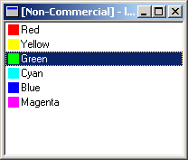
Figure 13-2 A QListBox with QListBoxPixmaps
When dealing with more complex, multi-column data the QListView widget is better suited than the QListBox. The QListView can show multi-column data stored as a list or in a tree structure. Each column can have a header that allows sorting by clicking to the users. Figure 13-3 shows a screenshot from the example application.
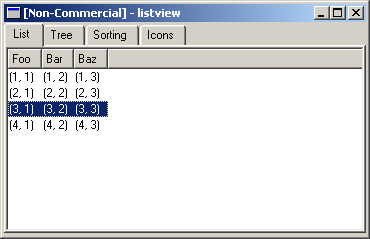
Figure 13-3 The list tab
The list view widget is fairly complex, so the example is split into four parts, each shown in a different tab in the example application. We start with the most basic case - a simple list with multiple columns. This is shown in the tab titled "List" shown in figure 13-3. The code setting up the list view is shown in example 13-4.
QWidget *ListViewExample::setupListTab()
{
m_listView = new QListView();
m_listView->addColumn( "Foo" );
m_listView->addColumn( "Bar" );
m_listView->addColumn( "Baz" );
m_listView->setAllColumnsShowFocus( true );
new QListViewItem( m_listView, "(1, 1)", "(1, 2)", "(1, 3)" );
new QListViewItem( m_listView, "(2, 1)", "(2, 2)", "(2, 3)" );
new QListViewItem( m_listView, "(3, 1)", "(3, 2)", "(3, 3)" );
new QListViewItem( m_listView, "(4, 1)", "(4, 2)", "(4, 3)" );
return m_listView;
}
Example 13-4
The code shown the basic steps needed to use a list view. First, a number of columns are created. Then, any special settings are made. In this case, we make sure that the selection is shown over the entire row, and not just in the first column. Finally, we populate the list by creating a set of QListViewItems refering to the list view as parent.
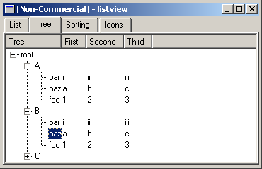
Figure 13-4 The tree tab
The second usage case is to show the list view items in a tree hierarcy. This is shown in the tab titled "Tree". The code setting up the list view is shown in example 13-5. When running the example application, try to click on the column headers to sort the items. Notice that each branch ("A", "B" and "C") are sorted separately.
QWidget *ListViewExample::setupTreeTab()
{
m_treeView = new QListView();
m_treeView->addColumn( "Tree" );
m_treeView->addColumn( "First" );
m_treeView->addColumn( "Second" );
m_treeView->addColumn( "Third" );
m_treeView->setRootIsDecorated( true );
QListViewItem *root = new QListViewItem( m_treeView, "root" );
QListViewItem *a = new QListViewItem( root, "A" );
QListViewItem *b = new QListViewItem( root, "B" );
QListViewItem *c = new QListViewItem( root, "C" );
new QListViewItem( a, "foo", "1", "2", "3" );
new QListViewItem( a, "bar", "i", "ii", "iii" );
new QListViewItem( a, "baz", "a", "b", "c" );
new QListViewItem( b, "foo", "1", "2", "3" );
new QListViewItem( b, "bar", "i", "ii", "iii" );
new QListViewItem( b, "baz", "a", "b", "c" );
new QListViewItem( c, "foo", "1", "2", "3" );
new QListViewItem( c, "bar", "i", "ii", "iii" );
new QListViewItem( c, "baz", "a", "b", "c" );
return m_treeView;
}
Example 13-5
The code is structured in the same way as the basic list. The difference is that instead of using the list view widget as parent for all items, some items has other items as parents. The reason for setting the decoration of the root item is to provide user feedback. Just seeing the item "root" does not tell the user that there are more items. The plus sign to the right of the text tells the user that.
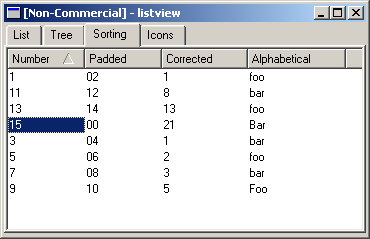
Figure 13-5 Sorting per column
The third usage case demonstrates a common problem that most windows users are aware of. If you try to sort numbers while treating them as text strings, number ten will end up between number one and number two. The easiest, but not the prettiest, solution is to pad the numbers with the missing zeroes to the left of the number or to treat the strings as values instead of pieces of text.
class SortItem : public QListViewItem
{
public:
SortItem( QListView *parent, QString c1, QString c2, QString c3, QString c4 ) : QListViewItem( parent, c1, c2, c3, c4 )
{
}
int compare( QListViewItem *i, int col, bool asc ) const
{
if( col == 2 )
return text( col ).toInt() - i->text( col ).toInt();
else
return QListViewItem::compare( i, col, asc );
}
};
Example 13-6
The sorting example uses a custom list view item class shown in example 13-6. The custom item class re-implements the compare method and treats the third column as a number instead of a text string. The other columns use the standard QListViewItem::compare method.
Try running the example as shown in figure 13-5. Sort on the different columns and notice how it works. Also, notice how the sorting on the fourth, text-only, column takes the character case into account. The code setting up the sort list view case is shown in example 13-7.
QWidget *ListViewExample::setupSortTab()
{
m_sortView = new QListView();
m_sortView->addColumn( "Number" );
m_sortView->addColumn( "Padded" );
m_sortView->addColumn( "Corrected" );
m_sortView->addColumn( "Alphabetical" );
m_sortView->setShowSortIndicator( true );
new SortItem( m_sortView, "1", "02", "1", "foo" );
new SortItem( m_sortView, "3", "04", "1", "bar" );
new SortItem( m_sortView, "5", "06", "2", "foo" );
new SortItem( m_sortView, "7", "08", "3", "bar" );
new SortItem( m_sortView, "9", "10", "5", "Foo" );
new SortItem( m_sortView, "11", "12", "8", "bar" );
new SortItem( m_sortView, "13", "14", "13", "foo" );
new SortItem( m_sortView, "15", "00", "21", "Bar" );
return m_sortView;
}
Example 13-7
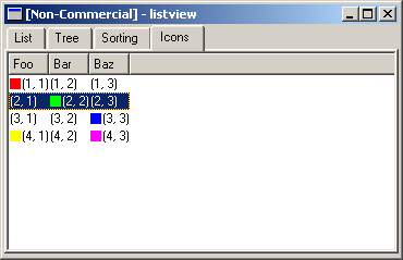
Figure 13-6 Icons in a QListView
The "Icons" tab shows how easy it is to put icons into a list view. There can be different items in different columns and multple icons on each row. The source code is shown in example 13-8. As you can see, putting an icon into a column is as easy as calling setPixmap.
QWidget *ListViewExample::setupIconTab()
{
m_iconView = new QListView();
m_iconView->addColumn( "Foo" );
m_iconView->addColumn( "Bar" );
m_iconView->addColumn( "Baz" );
m_iconView->setAllColumnsShowFocus( true );
QPixmap pm( 10, 10 );
QListViewItem *lvi = new QListViewItem( m_iconView, "(1, 1)", "(1, 2)", "(1, 3)" );
pm.fill( Qt::red );
lvi->setPixmap( 0, pm );
lvi = new QListViewItem( m_iconView, "(2, 1)", "(2, 2)", "(2, 3)" );
pm.fill( Qt::green );
lvi->setPixmap( 1, pm );
lvi = new QListViewItem( m_iconView, "(3, 1)", "(3, 2)", "(3, 3)" );
pm.fill( Qt::blue );
lvi->setPixmap( 2, pm );
lvi = new QListViewItem( m_iconView, "(4, 1)", "(4, 2)", "(4, 3)" );
pm.fill( Qt::yellow );
lvi->setPixmap( 0, pm );
pm.fill( Qt::magenta );
lvi->setPixmap( 2, pm );
return m_iconView;
}
Example 13-8
Working with the list view is similar to working with the list box. The signal selectionChanged is still available along with the methods isSelected and setSelected. In modern applications I actually prefer the list view in front of the list box because the list view provides column headers that provides more information to the users.
One problem when working with any list is to coordinate the contents of the list and the contents of the application data. For example, let us say that you have a phone book application. Each phone book item has a picture and some details associated with it together with the name, phone number, email, address, etc. The list view showing a list of contact is not intended to show all the information. Perhaps just the names of the contacts are interesting until an item is selected. There are several approaches to handling this problem:
The first three solutions are the one that I prefer. Number three if only one view is required, number two if all the data is held in memory and number one if the data too large to be kept in memory. To implement the first solution a hidden column is required. Any column that is to be hidden needs to have the width mode set to manual. The code for hiding column three of the list view, lv, including the altering of the width mode, is shown in example 13-9.
lv->setColumnWidthMode( 3, QListView::Manual );
lv->hideColumn( 3 );
Example 13-9
As the data gets more and more structured and complex the list view and list box might seem to simple. Instead a table is required. Using a QTable widget, each table cell can hold a different widget. For example, checkboxes, dropdown lists and simple text can be kept in a cell.
It is easy to create a table and populate it with items using the setText, setPixmap and setItem methods.
The real trick, when using tables, is to be able to create custom items. This is used to provide a better experience to the users. For example, instead of selecting the name of a colour from a drop down list we will provide an item that shows a list of the actual colours and lets the user pick one of them. A screenshot from the resulting application is shown in figure 13-7.
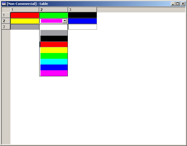
Figure 13-7 A QTable with ColorTableItems
What we have done is that we have sub-classed QTableItem and created the new class: ColorTableItem. The class declaration is shown in example 13-10.
class ColorTableItem : public QTableItem
{
public:
ColorTableItem( QTable *table, const QString &color );
QWidget *createEditor() const;
void setContentFromEditor( QWidget *w );
void paint( QPainter *p, const QColorGroup &cg, const QRect &cr, bool selected );
};
Example 13-10
From looking at the code above one can see that the interesting methods are paint, createEditor and setContentFromEditor. The last two works as pair while the first can be implemented independently of the others.
The paint method takes the cell text which is assumes is the name of a colour. It then fills the cell with that colour. Example 13-11 shows the implementation of the paint method.
void ColorTableItem::paint( QPainter *p, const QColorGroup &cg, const QRect &cr, bool selected )
{
if( text() == "White" )
p->setBrush( Qt::white );
else if( text() == "Gray" )
p->setBrush( Qt::gray );
else if( text() == "Black" )
p->setBrush( Qt::black );
else if( text() == "Red" )
p->setBrush( Qt::red );
else if( text() == "Yellow" )
p->setBrush( Qt::yellow );
else if( text() == "Green" )
p->setBrush( Qt::green );
else if( text() == "Cyan" )
p->setBrush( Qt::cyan );
else if( text() == "Blue" )
p->setBrush( Qt::blue );
else if( text() == "Magenta" )
p->setBrush( Qt::magenta );
p->drawRect( table()->cellRect(row(), col()) );
}
Example 13-11
The createEditor and setContentFromEditor work together. First, createEditor creates the widget that is used to edit the cell, then the result is harvested from the editor widget using the setContentFromEditor. So, in example 13-12 the code for createEditor is shown. It creates a combo box, which is a drop-down list box, with color items. It also makes sure that the right item is selected from the list.
QWidget *ColorTableItem::createEditor() const
{
QComboBox *cb = new QComboBox( table()->viewport() );
QObject::connect( cb, SIGNAL( activated( int ) ), table(), SLOT( doValueChanged() ) );
QPixmap pm( 100, 20 );
pm.fill( Qt::white );
cb->insertItem( pm );
pm.fill( Qt::gray );
cb->insertItem( pm );
pm.fill( Qt::black );
cb->insertItem( pm );
pm.fill( Qt::red );
cb->insertItem( pm );
pm.fill( Qt::yellow );
cb->insertItem( pm );
pm.fill( Qt::green );
cb->insertItem( pm );
pm.fill( Qt::cyan );
cb->insertItem( pm );
pm.fill( Qt::blue );
cb->insertItem( pm );
pm.fill( Qt::magenta );
cb->insertItem( pm );
if( text() == "White" )
cb->setCurrentItem( 0 );
else if( text() == "Gray" )
cb->setCurrentItem( 1 );
else if( text() == "Black" )
cb->setCurrentItem( 2 );
else if( text() == "Red" )
cb->setCurrentItem( 3 );
else if( text() == "Yellow" )
cb->setCurrentItem( 4 );
else if( text() == "Green" )
cb->setCurrentItem( 5 );
else if( text() == "Cyan" )
cb->setCurrentItem( 6 );
else if( text() == "Blue" )
cb->setCurrentItem( 7 );
else if( text() == "Magenta" )
cb->setCurrentItem( 8 );
return cb;
}
Example 13-12
Then, as shown in example 13-13, setContentFromEditor simply takes the editor widget, checks so that it is a combo box and puts the result back into the cell.
void ColorTableItem::setContentFromEditor( QWidget *w )
{
if( w->inherits( "QComboBox" ) )
{
switch( ((QComboBox*)w)->currentItem() )
{
case 0:
setText( "White" );
break;
case 1:
setText( "Gray" );
break;
case 2:
setText( "Black" );
break;
case 3:
setText( "Red" );
break;
case 4:
setText( "Yellow" );
break;
case 5:
setText( "Green" );
break;
case 6:
setText( "Cyan" );
break;
case 7:
setText( "Blue" );
break;
case 8:
setText( "Magenta" );
break;
}
}
else
QTableItem::setContentFromEditor( w );
}
Example 13-13
The code setting up the table with the custom item is shown in example 13-14. Notice that the colour names has to be valid for it to work, but that can be improved using an enumerated type, or simply a QColor.
QTable t( 3, 3 );
t.setItem( 0, 0, new ColorTableItem( &t, "Red" ) );
t.setItem( 0, 1, new ColorTableItem( &t, "Green" ) );
t.setItem( 0, 2, new ColorTableItem( &t, "Black" ) );
t.setItem( 1, 0, new ColorTableItem( &t, "Yellow" ) );
t.setItem( 1, 1, new ColorTableItem( &t, "Magenta" ) );
t.setItem( 1, 2, new ColorTableItem( &t, "Blue" ) );
t.setItem( 2, 0, new ColorTableItem( &t, "Gray" ) );
t.setItem( 2, 1, new ColorTableItem( &t, "Cyan" ) );
t.setItem( 2, 2, new ColorTableItem( &t, "White" ) );
Example 13-14
There are some limitations with the QTable class that has opened a marked for third party solutions. One of them is QicsTable from ICS which is available under a dual license just as Qt. The open source version is GPL licensed. It offers more flexibility in all parts of the class ranging from a model-view-controller architecture to mergable cells, more flexible headers, lockable rows and columns, the ability to print the whole or parts of the table, etc. There is a paper available from ICS titled Beyond QTable that discusses the differences between QTable and QicsTable.
In Qt 4, the QListView and QTable classes will be partially merged as a part of the Interview framework. The architecture will be based around views and a model holding the data. This reduces the need for storing information in several places in the main memory (i.e. as a list view item and in an application specific data structure). More information concerning Qt 4 is available from Trolltech.
The code from this chapter can be downloaded from here.
Qt Quarterly has a couple of articles that are related to the subject of this chapter: 1 and 2.
This is a part of digitalfanatics.org.
Copyright (c) 2002-2004 by Johan Thelin (e8johan -at- digitalfanatics.org). This material may be distributed only subject to the terms and conditions set forth in the Open Publication License, v1.0 (local copy) or later (the latest version is presently available at http://www.opencontent.org/openpub/). Distribution of substantively modified versions of this document is prohibited without the explicit permission of the copyright holder. Distribution of the work or derivative of the work in any standard (paper) book form is prohibited unless prior permission is obtained from the copyright holder.